Nokia Research Center Global Brand
My first objective as the Manager of Creative Services was to find an identity for the Nokia Research Center. With little direction, I took notes from the visual inspiration provided in the Nokia brand style guide and created a graphical lockup specific to NRC.

Brand Inspiration

Core lockup

Regional Lockup
With this sub-brand in place, I continued to evolve it over time into it’s own unique persona: logos, guidelines, branded assets and branded templates all allowed my team to create work that was consistent while still staying in alignment with the Nokia master brand.

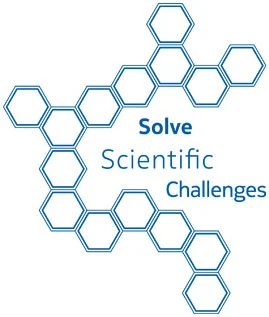
Because the hexagon is a fundamental scientific icon, I used it to relate to the 3 brand pillars:
‘Explore New Technology Frontiers’ is symbolized by the outlined hex; unclear what the exact form will be, but the direction is there.
‘Solve Scientific Challenges’ is represented by the outlined hex; more clarity since it is near-future research but still not quite ready for wide adoption.
‘Deliver Irresistible Personal Experiences’ is shown with a solid hex; a tangible product or service made possible by the years of hard work and research from the previous 2 pillars.


collateral Hex lattice Evolution


Tradeshow visuals


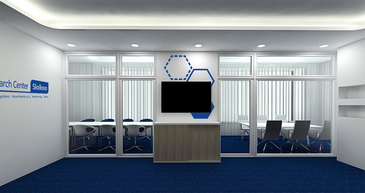
Lab Branding & Decor


Digital Expressions

The standard lab map was leveraged as both lab decor and throughout marketing collateral and digital tools.
Branded openings for all videos were created using the Explore, Solve, Deliver hex language as seen in the opening of this NRC 25th Anniversary event video.