RobertHalf.com
A customer-first approach
Business performed through the website was responsible for millions of dollars each year. Seeing even a slight increase in performance meant hundreds of thousands of dollars to the business, so making sure users are able to quickly and efficiently do what they needed to was our goal.
Each of these projects spanned months to a year and involved detailed user flows, research, wireframes, prototypes, high-fidelity mockups, style guides, testing and QA. Once launched, we analyze the performance, see what worked or what didn’t, then repeat the process with any learning and/or new feature requests.
The logged in user experience (LUX)
Personalization impacts site-wide functionality and usability: multiple backend platforms spanning several IT teams were involved and we had to work them into a seamless customer experience.
Separate functionality consolidated in user dashboard including time sheets, contact info, tax documents, and personal preferences.
Connecting to outside APIs like Dropbox, LinkedIn and Salesforce were incorporated in our custom UI.
Logged in users access customized content and functionality based on personal preferences and previous site activity.


Accessibility & Improved Usability
The business requested an analysis of the global websites for ADA compliance; we came back with recommendations to help improve usability and unify the global UI:
Updates suggested for AA/AAA accessibility compliance included color updates to the UI style guide for readability, font size adjustments, a new form structure site wide and alternate text in imagery and forms for screen readers.
New form UI designed to keep the interface clean, bridge site-wide functionality owned by separate IT teams and build in future functionality.
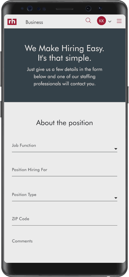
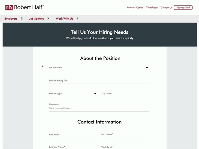
Functionality that matters to users
User interviews and testing dug deep into what customers wanted to do on our website and what was lacking from their perspective. This allowed us to create a world-class candidate browsing experience and payment portal for businesses along with a streamlined job viewing and application process for potential candidates.
Job Search
Job search is the bread and butter of the Robert Half website, and the goal was to continue to improve the online experience of finding and applying for jobs.
Search functionality continually tested and improved via user interviews, A/B testing and monthly analytics reviews.
Job application process improved to include LinkedIn, saved resumes, job alerts and a history of job applications.
UI improvements suggested included cleaner layout with more whitespace and readability, continuous scrolling, and shortlists.

Candidate Browse
Candidate Browse allowed companies to search the candidate database directly from an availability dashboard. Limited by both the user data stored and not revealing too much information, we constantly refined the experience as we learned more about how companies wanted to hire using our online tools.
Streamlined filters based off multiple user tests.
Potential for sending candidate lists via email automation required separate layouts with dynamic linking.
New layout of candidate browsing resulted in nearly 40% lift in client calls and conversions.


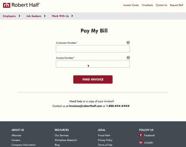
Client Payment Portal
Part of our digital transformation was moving many business processes online and allowing users to control more of how and when they engage with us. This new portal allowed clients to manage their bills, pay partial invoices and select from various payment methods, all depending on their business’s needs.
Needed to understand the full invoicing process, which involved initial user flows and working directly with finance business partners throughout the project.
Worked with multiple IT teams assigned to the website, Salesforce and corporate accounting tools to determine what was technically possible.
The result was a fluid payment experience where users were a few clicks away from moving on to other business rather than spending all day trying to pay their bill.